As anyone who has used a website knows, the easier and more pleasant the site is to navigate, the more inclined users are to stick around. In Denver web design, it’s up to designers to come up with ways to make users’ experience more efficient and enjoyable so they’ll stay longer. The trends for web design 2023 seem to be aimed at giving users the kind of experience that encourages engagement.
Encouraging engagement is, of course, the whole point of web design. The design tools have been available for a long time. What’s happening in 2023 is more an evolution than a revolution. But, like many evolutionary changes, those in web design can make websites more adaptable to changing circumstances, such as user needs and preferences.
For example, designers have been at work in the mobile world for years, but they’re getting away from merely adapting desktop sites. They’re finding ways to use tools already in existence to improve functionality. Incorporating video onto websites is not new either, but designers are working to enhance its videos’ value for users.
Textures have became something of a fad a few years ago until they developed into more of a distraction than an asset. Where textures used to be relegated to backgrounds, now they’re being used more judiciously to pull user’s eyes to content they might otherwise miss.
Building trust in a world that has become increasingly untrustworthy has led designers to incorporate more trust-enhancing features. Hoverable icons are nothing new, either, but designers are finding ways to make them work better.
Website designs are part of a dynamic industry adapting to the changing needs of website users. As those needs evolve, so do the designers. Here, in no particular order, is more about the five trends mentioned above.

A FOCUS ON MAKING MOBILE SIMPLER
It looks like websites that come up on a user’s phone will begin to look more like mobile apps. They won’t look so much like mere adaptations of desktop sites. In other words, mobile sites will see innovations that will meet the specific needs of mobile users. For example, they won’t have to work so hard to locate information, such as links, and then find it again. The data they’re looking for will appear on the screen throughout their experience, making it fast and easy to recover.

Adding Texture to Attract the Eye
In website design, texture was once something of a fad. In 2023, it will become more of a strategic tool.
Textured backgrounds fell out of favor because, instead of encouraging users’ eyes to linger, they just grew bothersome. In 2023, textured shapes will become smaller but will serve a purpose beyond decoration. They will be used to make sites more interesting and to draw users’ eyes to specific areas of the screen or allow for a more comprehensive view of the information on the screen, making it more likely that users will see more and interact more. Users will get more of a “feel” for the subject of the site, especially if it features products with a tactile or other sensory characteristic.

Encouraging Trust
In an age of disinformation and misinformation, trust is more difficult to build and maintain. The sources that help develop trust in websites–as in any other endeavor that relies on a relationship–have been known for a long time. They include:
• Experts
• Celebrities
• Other users
• Crowd wisdom (if a lot of people express trust in a site, it’s probably trustworthy)
A good personal experience with the site will, of course, establish trust as well. The other sources will help get the user to give the site a try and give the trust-building process a boost.
In 2023, web designers will make room for these “social proof” sources on the sites they design to give users more confidence in the veracity of the content.
Trust-building content can take a number of forms. For example:
• Testimonials from people who use the site
• Testimonials from experts and/or celebrities
• Seals to reassure users that any information they provide or transactions they make are secure
• Links to other sources that give users reason to believe any claims made on the site

Including Video
Embedded video can serve many functions. It can be used to provide testimonials, how-to directions, corporate history, personnel introductions, process illustrations, etc. These programs can make use of creative animation and other graphic features to enhance interest and make information easier to understand.
Designers will consider the placement and number of videos. Too many videos will slow site loading and become frustrating for users. Where to include videos will depend on whether they will enhance information delivery. In any case, video gives users a choice: If they don’t like to slog through text, they can skip the book and take in the movie.

Using Hoverable Icons
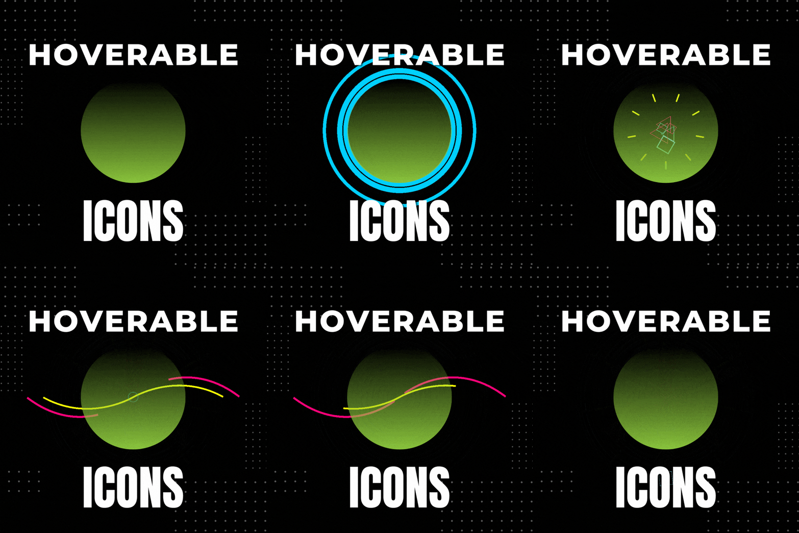
No one would dispute the value of icons as symbolic shorthand. Just look at emojis. On websites, icons can direct users without the need for any text, at least when their meaning is obvious. Few users are going to have trouble interpreting a shopping cart icon. But what if the meaning is a bit more obscure for at least some users? Designers are learning to combine text and graphic to make the purpose clear. When a user hovers over an icon, a brief text blurb appears for clarification. It’s just one way designers are adapting known tools to make life easier for users.
The Old Made Better
What these trends show is that innovation in web design doesn’t have to come from earth-shattering, explosive change. It can arise from combining or recombining elements, such as text and graphics, in ways that make navigation easier and faster, if not more intuitive. It’s thinking that makes information easier to find and recover. It’s making use of tools that give users access not only to information but to creative and entertaining presentation of that information.
Denver web design in 2023 demonstrates that designers know they can’t just rest on their laurels. They have to look carefully at users’ needs to help create long-term relationships between those users and the websites they visit. They’re finding ways to build trust, make the user experience enjoyable, efficient and productive. They’re recognizing and adapting to the different ways users interact with the web, altering their designs to create positive experiences, whether they occur on a mobile screen or on a desktop screen.
Creative innovation doesn’t necessarily mean creating something entirely new. Such innovations are actually quite rare. Most progress is made incrementally, one step at a time. The first moonwalk wasn’t possible when Orville and Wilbur Wright flew for 12 seconds and a distance of 120 feet at Kitty Hawk off the North Carolina coast on December 17, 1903. The launch of a Saturn V rocket at Cape Kennedy on the coast of Florida required more than five decades applying centuries of hard-earned knowledge and experience to the task of sending Edwin “Buzz” Aldrin, Neil Armstrong and Michael Collins to the moon and enabling Armstrong to take a stroll on the surface.
The steps web designers will take in 2023 will lead to more exciting progress in 2024 and beyond. The tools are there. The innovations are up to the designers who use them.

